DYING FOR A DONUT
What makes you drool over a book? Is it the title? If so, how could you resist a book called Dying for a Donut? A lip smacking mystery. (Sorry, couldn’t help myself.)
Or is it the cover that first catches your eye?
COVER 1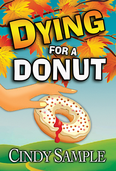
We’ve all heard that phrase, “a picture is worth a 1,000 words,” supposedly coined by Fred R. Barnard in 1921 when he promoted images in advertisements first appearing on the sides of streetcars. Others believe it’s an old Chinese proverb. Or a Japanese proverb. Who knows? What I do know is that I truly want my book covers to hint at the magic that occurs on the pages of my books.
COVER 2 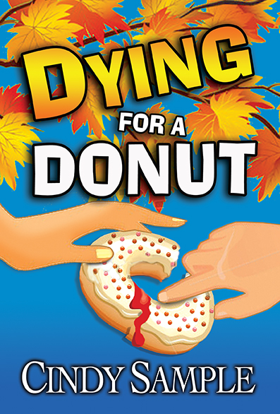
So how does an author find a way to combine humor, homicide and romance all in one tasty cover? There are so many elements to convey in a mystery. Do we display the victim who was powder-sugared to death? Is the killer a man or a woman? I didn’t even know whodunit until 175 pages into the story. I will say one thing–– this story is definitely a doozy! And it takes place in the fall at one of my favorite areas-Apple Hill.
COVER 3 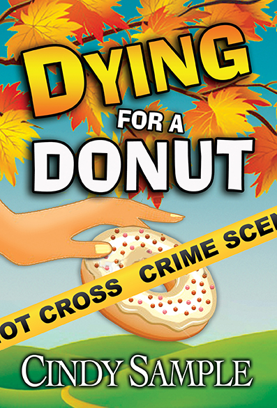
My wonderful cover artist, Karen Phillips, has designed three different covers. Let me know your thoughts. Pick one of the three covers or combine elements from several of them. I would love to see your creative ideas so feel free to share suggestions of your own. If you leave a comment by July 17th, you’ll be entered in a drawing to win the first signed copy of Dying for a Donut plus a $10 gift certificate to your favorite donut hangout.
I definitely like the third cover best. They are all great as far as “punch” but I’m sorry, I’m not too happy to see blood coming from a donut! Especially one that looks do delicious!
Thanks, Terry. It’s difficult to display blood on a donut. I like the crime scene tape myself!
Hi Cindy…..I just found you via a long distance e-mail friend with whom I’ve just reconnected after many years….Yes, the distance is 3,000 miles but the friendship is only a click away. She and I both enjoy reading and I had suggested several of my favorite authors to her and she in return suggested your books.
I can’t wait to find your latest recommended book by my friend: “Dying for a Donut” because the title fascinates me as I was ‘raised in my dad’s little bakery with …..well yes…raised with the donuts! ….mixed the dough, watched them rise, cut them out, fried them, iced them, sold them!…oh yes and ate them too! Still do!
I am an amateur story teller and writer having written about 50 short stories and a collection of Celtic Fairy Tales, all of which I bind and give away as gifts. As you, I get my inspiration from everyday life and the interesting, funny or poignant happenings that surround me. Now I’m off to the book store or will go on line to find about that donut! Sincerely, The Donut Girl 🙂
Hi Char. How nice to meet you across the miles. I hope you enjoy Dying for a Donut. I have to admit that research almost killed me:-) Hope to her from you again soon.
Absolutely the third one (with crime scene tape). Other two are gross enough to make me wrinkle my nose. 🙂
You’re so funny. I certainly don’t want to gross you out! Or make donuts less appealing. Thanks for commenting.
like the third one and so glad you did not show a chocolate one! Love all your books and YOU are a keeper too! Thank you so much for all you have done for the writing community.
Thanks, Linda. You are too kind. I love our local writing community and how supportive we are of one another. I may love chocolate, but it doesn’t work for book covers (just on my plate)!
I see most of your comments picked No. 3 BUT I liked No. 1 the best. All three are great covers, but I prefer the coloring of No. 1 and the shock factor of blood from a donut. I know you will pick the best.
Good luck.
Betty, thanks for commenting. A couple of people on Facebook felt the same way you do – keep it simple with # 1. It’s fun reading all the comments and suggestions.
Definitely #3 for me! Leaves and crime scene tape. Blood on donuts, sorry to say, does gross me out. LOL! This is ironic considering the gore I’ve watched in my day on shows like Bones.
Thanks, Joyce. It is kind of funny that the blood is grossing out all of these mystery writers and readers!
Cindy, I like a combo of two and three. A few less leaves. The dark blue background for contrast and the crime scene tape instead of blood on the donut. Would make me think twice about eating a jelly donut. Ugh. Concept is super though. It’s clearly fall and you’re dying for a donut! Who isn’t when there’s a nip in the air?
Thanks, Linda. I think your suggestions work very well with our concept. And I don’t want the cover to turn people off donuts forever!
Okay, as a quasi-CA, I would say make the leaves at the top of less significance, in all of the choices unless Fall features largely in the story. The focus should be more on the donut and hand. The idea of the crime scene tape is good, (so I’m leaning to #3). The tape might be a place to have the blood. Also not sure what the red dots on the frosting are, but consider losing them. If you keep blood either on the tape or in the scene behind it, (maybe one of the leaves) you don’t need any red on the donut. Consider making the frosting REALLY thick and gooey, a person’s dream of the frosting on a donut. I think this is going to be another hit in you “Dying For A….” series. I’m so excited for you!
H
Thanks, Heather. I’m not sure what flavor of donuts are available in clip art but I think she could lose the sprinkles. Apple Hill is only open in the fall and this is the only cover suitable for using leaves, but a few less would work out fine and add emphasis to the DONUT!
Hi Cindy. They are all intriguing. The blue background really shows off the title and the crime scene tape definitely lets you know there is more to this book than breaking one’s diet! :). Can’t wait to read it????
Thanks, Helen. I think the book definitely needs the darker background. So far # 1 and # 3 are almost tied! I’ll keep you posted!
I Like Number 1 the best.
Hi Beth, thanks for voting. Hope to see you at the launch party. Donuts galore!
I like #3 only. The blood on the donut is a turnoff. Can’t wait to read about Apple Hill and hope to be enjoying a donut while I do! Will you be at the state fair again? I enjoyed meeting you there last year.
Hi Kathleen. Thanks so much for voting. I definitely want you craving a donut while you read the book:-) Yes, I’ll be in the Author’s Booth on 7/11, 7/13, 7/15 and 7/17. Stop by if you’re attending on any of those days!
Aloha Cindy!
I personally like cover #1. Can’t wait for the books to arrive.
Congratulations on another wonderful title!
Brenda
Kona Stories Book Store
Thanks, Brenda, one of my favorite booksellers. I really appreciate your input. I can’t wait to type THE END!
Cindy, I like the openness of number one and the details of the crime scene tape in number 3. I think that the leaves are distracting and could be minimized, if not removed entirely. Since some people might find the blood unappealing, multicolored sprinkles might be a better choice.
Best wishes with the project!
Baird
Thanks, Baird. I hope you’re all settled because we need to calendar in the book for you to read:-) Thanks for your input. I agree we definitely have one or ten leaves too many!
i think #1 is closest. Perhaps have the “blood” come out from inside the hole, kinda like a jelly donut so it’s ambiguous? Is the red ooze from the donut jelly or blood? Just a thought.
Thanks, Sheryl. The red ooze is supposed to be blood but it does resemble donut jelly which really wasn’t our intent. Cover art is tricky stuff!
The third cover draws me in! Blood on a donut is off-putting.
Thanks, Bonnie. A few people thought the blood looked like jelly, but a lot of people thought it was icky! Thanks for commenting.
Looks like another fun story!
I like a combination of the deeper blue sky on #2 with the crime scene tape on #3. I’d like to see more of the “n” in “not” on the tape. Prefer showing only one hand. If you keep the hills, you may want to lose the sprinkles for simplicity’s sake.
🙂 Nice!
Thanks, Teresa. This is why I love getting everyone’s input. I didn’t catch the missing “N.” Also toning down the sprinkles is a good idea. We don’t want the focus on them.
Definitely the third one. Like so many others who have commented, I’m not keen on seeing blood coming out of a donut. Yuck! Also, maybe a few less leaves, as it’s almost too busy. Do the autumn leaves and grassy hills relate to the story line? Just wondering, since it seems to be a theme in two, with the leaves still present in the remaining one.
HI Laura. Thanks for stopping by. The books takes place in the fall and I’ve always been an autumn leaf addict. Plus it’s the only book that they will make sense, but I definitely think we need to remove the leaves behind the word DONUT. Far too busy as you mentioned.
Definitely the third cover. I have to agree with those who found blood coming from a donut disturbing. Of course, if it was a jelly donut, it could be jelly. But that would be confusing. As you already pointed out! One question I had: while I love the leaves, I wasn’t sure what message they were sending. I know they’re telling me it’s fall. I just wonder what that has to do with donuts. Or am I being too anal?
I love your analysis, Ellen. The leaves were just an idea of mine to add to the composition, plus the action takes place in the fall when Apple Hill farms officially open. I may offer a leafless version when we get all the comments in. I think I’m up to about 9 different versions at this point! Thanks.
I prefer the second one. The crime scene tape didn’t make me curious–most mysteries have crimes–but the two hands on the donut and the blood? I’m curious. Of course, I’m the oddball who doesn’t like donuts so maybe that factors in. Blood on a donut didn’t bother me a bit.
I thought the two hands were intriguing, which is why it was one of the options. Thanks for adding in your vote.
I’m just a bit different then everyone. I agree with the ick factor of blood on a donut. I do prefer number 3, but I’m wondering what it would look like with the pale sky color extending to the bottom without any green. I like the lighter, dimming blue better than the darker blue. Possibly the blue could be darker still at the top, but dimming? Maybe the word ‘dying’ in white also? With the style, the dots on the donut seem just fine, giving a little texture to the image, but not being exactly what kind of sprinkles are on top.
The title intrigues me. Makes me want to know how the story turns out.
Thanks, Norma. Great comments. That’s a new concept with the dimming of the blue. As for the title, my DYING titles are always in yellow (a branding thing) so we’re stuck with that. I’m glad you like the title. The story is fun, too, although I’m not the most objective reader!
Cindy — I agree that a bloody doughnut wouldn’t be attractive to either my palate or my potential reader. So, of the three, I prefer #3. However, had you or Karen considered using an oversize donut (with sprinkles, of course) for the “O” in Donut? Which would then suggest incorporating a gun or knife or bludgeon or poison bottle (or whatever the murder weapon is) perhaps half hidden in the fall leaves/or in a bushel of apples — which I would prefer rather than the (cliche alert!) yellow crime scene tape.
Hi John. I love your creativity. The crime scene tape is cliché but so many people didn’t care for the blood/jelly on the donut that we were trying to figure out what to use. And the weapon, believe it or not, is the powdered sugar. I like your idea of the donut for the O except that my book titles all look the same for branding purposes. Keep those ideas coming though!
Hi, Cindy,
I like the third one with the crime scene tape best, but why not combine and have the blood dripping from the donut as well? Double the trouble.
Thanks Jacquie. You’re the fifth person to suggest that combination so that’s another potential selection!
Number three. Like many, blood coming out of a donut doesn’t appeal to me–and ruins donuts for me forever.
Thanks, Lynn. People may be put off donuts forever after looking at these covers!
I prefer the middle cover, Cindy. I like the closely touching fingers and feel that the third cover is a bit too crowded with the Crime Scene words. Overall, it’s a great cover!
Thanks for taking the time to review the covers, Nancy. Your vote has been added into the tally.
Cindy, for me, the third one was best. I pulled away from the blood on the do-nut…cute idea, but it made me squirm 🙂 And sugar, it is difficult to make me squirm when I’m around do-nuts! 🙂
Lo
I’m still amazed at how many people are squirming over that first cover. And I certainly don’t want the donut stores to refuse to serve me! Thanks for voting.
Cindy, I like the single hand and the crime scene tape on #3. However, I prefer the solid blue background on #2 to the landscape, partly because the leaves look like Fall and but the green hills don’t.
Hi Anita. Thanks for voting. Quite a few people suggested the darker blue background with the crime scene tape so you’re in good company. My other books all have something at the bottom – either grass, sand or a floor so I’m not sure if I need to continue with that theme or not. These covers get harder and harder as you go along in a series.
I like the third one. The.police tape gives it that extra little something!
Thanks, Caryn. You’re in the majority right now:-)
Hi Cindy,
Number 3 with blue background. It shows a sharper design. I like blood dripping over the Police tape. Though the setting is Apple Hill in the Fall, I believe the leaves could be not as pronounced.
As you know I am Queen of your Fan club
Bev
Thanks, Bev. There are really way too many leaves although I want a few scattered in there. That’s why I love getting everyone’s feedback. Hope to see you at one of my events!
I vote for the third one. I like the crime tape and position of hands better than the others.
Thanks, Susan. I appreciate a vote from another mystery author!
Definitely the third one. And losing the sprinkles would make things a little more tidy. No blood on the donut please, I like them too much . And its my own personal opinion that the leaves could be a little less pronounced. They overwhelm the donut (And I love donuts.
good luck with your new release. Helen
Thanks, Helen. I completely agree on less leaves. And you’re in the majority with no blood on the donut!
My vote is also for the 3rd cover. The only suggestion (other than fewer leaves) would to make the writing on the crime scene tape a tad smaller so the words can be more complete. When I read the tape, the combination of a doughnut with “ot Cross” put me in mind of hot cross buns. It took a second for me to realize it was meant to be “Do Not Cross.”
I think the blue background gives the cover a cleaner look.
Good luck!
Thanks, Valerie. I’m not sure where my cover artist found the crime scene tape but that makes a lot of sense! I think I may agree with the blue background too. That’s why I love these contests.
I really prefer the second cover, Cindy. It just seems more interesting to me, more active somehow. Plus, I love the eye-catching twist of the blood! Makes it different.
Thanks, Conda. I appreciate your vote and # 2 needs more votes!
No contest–it’s #3. The crime scene tape, the absence of blood (YUCK) the brilliance of eye-catching color.
Ha ha, Marilyn. You’re in the majority with no (YUCK) blood on the donut!
Of the three, I like the third best. I think it would grab me a bit more if it were slightly more photographic in look. I like the idea, as someone mentioned, of making the donut look irresistably yummy.
Thanks for voting, Paula. We’re stuck with clip art at this point for consistency, so the donuts aren’t quite as enticing as the ones in photographs but we’ll keep looking!
I like the third one better because it gives a hint of humor. I think if you didn’t put the title of the book fans would turn heads to see what the book is about. The second cover was pretty neat too because it reminds me of a jelly filled donut but my vote still goes to the third cover.
Thanks for commenting. We definitely want the covers to exude humor so I’m glad you liked that one.
Overall, I like book cover # 2 the best, with the all blue background. Your name really pops out at the bottom against the all blue background, and I think the title would as well, with fewer leaves. I like the 2 hands, fighting over the donut (although I didn’t care for the blood on the donut). Or I think a combination of #2 and #3 would also look good – the all blue background of #2 (minus the blood), and the crime scene tape of #3 (perhaps use smaller font, or have the tape angled more to allow more letters).
Thanks, Jean. I’m leaning towards the bright blue background myself. You’re in the majority when it comes to blood on the donut – not a favorite. Once my cover artist returns from vacation she’s going to play with that crime scene tape as well. I’ll keep you posted!
What can I say, I like No 1 the best. Could be because I’m hungry, and the donut is up front and center.
Ha ha, Trish. That one always makes me hungry too! Thanks for voting!
Love them all! But my choice is 3. Covers everything the story is about.
1) the Donut,
2) the Hills
3) Fall
So Bummed I missed you at the CA State Fair, I was not aware the authors were going to be there til
was there today. Congrats on New Book been waiting for it and can not wait to read it.
Thanks for commenting, Mary Beth. I’m sorry I missed you. I love chatting with people at the Authors Booth. I hope you had a great time at the fair. Your vote is official!