DYING FOR A COVER
Nothing defines a book more than its cover. In fact, fifty percent of readers purchase books based on the cover art. As a humorous mystery author, I not only want to create an enticing cover, but I also need to find a way to combine humor with homicide.
Now that can be a challenge!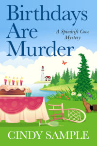
My amazing cover artist, Karen Phillips, has come up with two concepts for BIRTHDAYS ARE MURDER, the first book in my new Spindrift Cove Mystery series set in the Puget Sound area of Washington State. The series features Sierra Sullivan, a former cruise ship director, and the cousin of Laurel McKay. You first met her in DYING FOR A DIAMOND.
As you will note, the covers are similar but differ in title font, lighthouse shape, whimsical tree vs. regular tree, butterfly vs. seagull, and a table full of gifts vs. a tasty cake.
Feel free to vote on the individual elements of the covers. They can be mixed and matched.
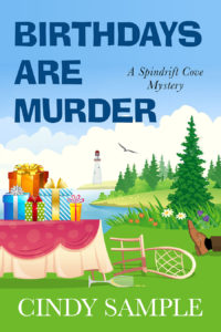
And yes, that foot is attached to a dead body!
As always, feel free to come up with your own recommendations. It’s fun for me to read your suggestions. If you leave a comment on this post by March 5, you’ll be entered in a giveaway for one of two $25 gift cards to the retailer of your choice.
So have at it!
March 1 update – After reviewing all the comments and votes, Karen has designed a third cover, combining elements from the first two covers. Keep on voting and sharing your thoughts. 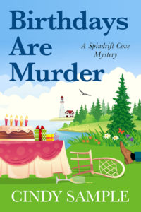
I like the second cover with the seagull, but prefer the serif font used for the title on first cover. Whichever, it’s an engaging cover promising a fun read.
Thanks for analyzing both of them. I’m having a lot of fun writing Sierra’s story.
I like the second cover. The font on the first though is my favorite. Really like the seagull.
Thanks so much, Sylvia. I appreciate your input.
I like the 2nd cover.
Thanks for voting, Leslie.
Tough choice but I am going with the second one!
Thanks for taking the time to vote, Renee.
I prefer the first cover with the whimsical tree. I also like that font and lighthouse design better. But, I prefer the sea gull to the butterfly. Overall, there’s just something more quirky and “off” about the first cover. Perfect for a “humorous homicide “. Looking forward to your new mystery series!
Thanks, Marla. Glad you like my quirky covers! Thanks so much for your comment.
I like the first cover, but I would change butterfly to the seagull. Maybe the cupcake could be exchanged for the small yellow and the green presents.
Thanks, Rhonda. I think switching out the cupcake for a present or two is a definite option. I appreciate it.
I love the first one with the butterfly! It caught and held my eye immediately! I think because it’s simple and allows the title to pop. I really dislike “busy” covers … But that’s just me. Congratulations on which ever one you select!!
I love getting everyone’s opinion. Thanks so much for the help, Brenda.
I like the second cover a little better – the font, the seagull, and colorful presents. How about having the cupcake on the table with the presents? I also like the lighthouse with the cottage on the first cover. I’m looking forward to the new book.
Great analysis, Melissa. Thanks so much for your suggestions.
I like the font and cake on #1. I prefer the tree and seagull on #2. I am looking forward to reading your new series!
Thanks so much for evaluating both covers, Kathleen. I’m looking forward to releasing my new series!!
I like the third cover but with the first font.
Thanks for voting. I appreciate the input.
I agree. I like the serif font on the first cover, but the presents on the second cover are more colorful than the cake! Either would work! Sounds interesting 🙂
Thanks for sharing, Alice. I appreciate it.
I like the one with the cake
Thanks for voting, Seema.
I prefer second cover due to more dramatic font and seagull circling ; mystery presents on table and tree looks scary too body on ground is perfect
Thanks so much for your input, Sue. I’m glad you like it!
I like the second one best, with the seagull, and the birthday presents on the table. I love all your books. Thank you!
Kathy Basham
Thanks for voting, Kathy. I’m so glad you’re enjoying all the books!!
The third cover is the perfect combination.
Thanks for voting, Jane. I’m glad you like it.
I like the first one’s font, the straight tree, and the little house by the lighthouse. The red makes it pop. Also, seagull rather than butterfly and cake!!!!
I love your detailed answer. Looks like I’m going to need a spreadsheet for this one!
I second what Michele Drier said!!!!!
Well, that made it easy! Thanks so much, Charlotte.
I like the birthday cake one.
Thanks so much for voting.
Whichever one you choose, it will be a winner!
You’re so sweet! Thanks, Heather.
I prefer the cover with the butterfly and the cake because: cake. But both are lovely and make me think of spring.
Thanks, Joanne. I like to think they are happy covers!
Cindy, I like the second cover because the bolder font pops and will be more visible in a thumbnail on ebook sites. I do like the red-roofed house on the first cover, but I prefer the birthday presents because you won’t have readers guessing by the number of candles how old the birthday person might be–and the presents are colorful and easy to see. Either way, you’ve got a winner. Definitely says humorous murder. But at first glance I missed the dead guy’s foot. You might want to extend his leg a little further into the picture.
Thanks, Linda. Great comments. We have pondered extending the leg a bit. I appreciate your input.
I like cover one with the house by the lighthouse, and the font.
I like the presents from cover 2, the straight tree and the seagull.
I do like the butterfly also, maybe it could be in the flowers or on the victim.
Thanks so much, Glenda. Great suggestion on moving the butterfly. I love it!
I like the first cover but with the seagull. I love cake so the picture of the cake would attract me to the book and I live in New Jersey if I see a lighthouse I would expect seagulls (who would attack the birthday cake in seconds) before seeing butterflies.
Great comments, Kenia. You are so right about those seagulls!
Cindy, I like them both when seen side by side and fairly small, but I think I prefer the second one with the gifts and seagull, straight tree. I think I like the title font on the first one–it matches your name, but overall I like number two and I agree that the title may be easier to read when small if you go with number two.
Are you going to parse all of these, a vote for this, a vote for that? Have fun.
Thanks for analyzing the covers, Kathy. The votes are stacking up in all directions!!
They both look great but I prefer the bold type for the title and the red butterfly looks fake but the seagull looks natural.
prefer the font on the top one, the straight tree, the lighthouse on top, the seagull, prefer the cake . show two legs maybe
Thanks for the suggestion, Amy. I didn’t think of two legs. I wonder how that would look?
I like the presents (makes the cover “Pop!”)
Thanks, Martin. They certainly do pop!
Prefer the font and lighthouse with attached house on top cover
Prefer the real tree vs the whimsical one
Prefer a seagull over the butterfly
Prefer the tasty cake over the pile of presents – perhaps he was poisoned?
Thanks so much for selecting your favorite elements. I really appreciate the input. And perhaps he was poisoned!!!
I like the first cover with the red-roofed house and cake, but maybe the use the straight tree and the seagull instead of the butterfly. I also prefer the font on the second cover.
Thanks for the detailed reply, Dawn. It’s all very helpful.
I like the table with the presents but also like the little house next to the Lighthouse in the first one. Although I prefer the font of the title on the first picture, the second font fits with your past covers better. I like the colors and look forward to seeing the finished product!
Thanks for analyzing all the components, Pat. I really appreciate it. I can’t wait to see the finished product as well!
I like the font on the second one, as well as the house by the lighthouse, and the cake instead of presents. But, I like the straight tree and the bird on the first one.
Congratulations on having good cancer scores! That’s fabulous news!!
Thanks for voting, Lynette. And yes, I’m very blessed with those great scores!
I like the first one with the straighten tree and the seagull.
I like both book covers, but my absolute favorite is the one with the gifts. Looking forward to reading it.
Thanks for voting. It’s going to be a fun read!
This is tough. I really like the bolder font. Gifts are better than the cake because with the lighthouse and candles it’s too much vertical. The butterfly is better than the seagull to bring out the whimsical. I almost over looked the foot so it might need to be positioned more prominently. Last, as a big lighthouse fan, I prefer the house attached as the Washington Sound lighthouse has one. Also, the other plain tower almost gets lost in the background. Thanks for allowing me to express my opinion. I am looking forward to reading this book.
I love both the covers, but the one that interests me the most is the little house right next to the lighthouse. In my opinion, it would be awesome to live next to a lighthouse. The birthday cake looks delicious. Keep up the great writing!
Thanks so much for your analysis, Michelle. Glad you’re enjoying the books!
I like both book covers, but my absolute favorite is the one with the gifts. Looking forward to reading it.
Thanks so much for your input, Jo.
Cindy, I like the first cover, but with the straight tree and the seagull. I think the font on this one is better (the other one is too chunky), but it reminds me a bit of a business font. Maybe there’s a better font than either?
Thanks, Margie. I have to tell you that choosing fonts makes my head explode. The darker font is similar to the DYING FOR series. But we could consider a third or fourth possibility. There are certainly enough choices.
I love the Boulder title. Love seeing lots or presents 🎁 versus a cake. Also love the seagull flying
Both are cool and I just love your books. Met you at the California State fair a few years ago at the authors booth. Thanks for writing your books 📚!
Hi Nancy. I remember you! I’m so glad you’ve been enjoying the series. Maybe we’ll be back at the Authors booth again this year. Or at least by 2022!
I prefer the serif font, but everything else on the cover with the seagull. Looking forward to the story with either cover!
Thanks so much, Marcia. It’s a fun one!
I like cover one with the house by the lighthouse, and the font.
I like the presents from cover 2, the straight tree and the seagull.
I do like the butterfly also, maybe it could be in the flowers or on the victim.
I love that idea of moving the butterfly elsewhere but keeping the seagull in the sky. Great idea, Glenda.
I like the the less bold title font of the one with the lighthouse. The other one jumps out too strongly.
Thanks so much, Rexine. Good analysis.
Okay, this is tough because they’re both great covers! But I like the one with the more lyrical font, the red-roofed house, the tippy tree top and the cake (as someone already said: cake!) However, I think the cupcake should be a present, one with a fluffy bow and flowing ribbons… and I like the seagull from the 2nd cover better than the butterfly; it goes better with the seacoast setting. I didn’t have any trouble finding the foot, it was almost the first thing I saw… but maybe that’s because I write mysteries and “kill” lots of people myself! LOL
Can’t wait to read it!
Terrific analysis, Susan. Funny how mystery authors tend to zero in on the dead body!
I like the top cover, but with the seagull
Instead of the butterfly – as much as I love butterflies, I just think the seagull fits in better there- and I like that lighthouse better!
Hi Linda. I prefer the seagull myself but I like letting everyone choose for me. Thanks so much.
I live the first one with the bright title and all the gifts on the table.
Thanks so much for voting, Teresa.
Good Morning…how fun to comment on this….well I LOVE the choice on the right….the bent tree…fun idea there..am also loving the whimsical font…and the table design… The other cover’s table looks a little too crowded for my taste. The red on the right also catches my attention. Have fun with your final choice! 🙂
Thanks, Valerie. I’m so pleased you love the cover. Thanks so much for voting.
Hello, Cindy!
The first cover is definitely softer (font, butterfly, pink cake). So it depends on what tone you want. If I had to vote, I would pick the second cover.
I am eager to read and share your new series!
Thanks for the analysis and your ongoing support, Sue. I so appreciate it!
I like the thin print… I think it looks more adult… and I do not like all capitals.
Thanks, Eva. Great insight.
Cindy, I like the “regular” font for the title, the seagull instead of the butterfly, and the “normal” tree. The regular font is a personnel opinion. I went to an island 10 miles out to sea to attend a family conference for 40 years and never saw a butterfly in the air but I did see many seagulls. There was another island close by on which a lighthouse stood. So I like the lighthouse with the building attached. If you were to use the whimsical tree I would tip it in the same direction as the chair at the table fell. I know a person probably made the chair fall and the tree moved in the direction of the wind, but the difference in the directions of the two just jars my sensibilities. Finally, I like the cake on the table (less cluttered) and it stands out. Instead of the cupcake, I might draw a bowl of ice cream, a glass for a drink, or nothing. Have fun deciding on the cover.
I have to agree about the direction on the tree. I doubt the wind blows from on shore, so the top is bent the wrong way.
I never would have thought of that. Great catch.
I like the font in the second cover (with the butterfly) and the cover of the first. However, it depends on how the person died – if it was from the cake, then the cake should be in the picture. thanks for asking
Thanks for voting. Actually, that champagne glass on the ground might contain some poison! Maybe.
I like the second book cover.
Thanks so much for voting, Alexis.
I like the first cover, but I would replace the butterfly with the bird from the second cover, remove the cupcake from the first cover(who wants a cupcake when you can have a full-on cake?!), And add a gift or two from the second cover….hope that wasn’t confusing…
Thanks, Joy. I never thought of combining the cake and a present or two. Great concept.
I like the regular font with presents on the table, i’d put the butterfly on the toe of the shoe, on the daisies or on a present. And then use the lighthouse with the attached building and the seagull. I don’t think you would be able to see a butterfly so far away, but I like the whimsey of it being on the cover. I like both trees but lean towards the one that shows the wind is blowing. I agree with those who think the part of the leg showing should be a bit longer. Can’t wait to read this new series. Thanks for showing us these covers.
Great suggestions, Iris, especially the butterfly on the shoe. Intriguing!
I like the top one better. The font seems cleaner and easier on the eyes–and who doesn’t like cake lol
Ha ha. Big cake lover here! Thanks for voting, Tari.
Myself I prefer the one with the cake. To me a cake usually means a birthday. Presents could be any kind of party. Looking forward to the new series.
Good analysis, Mike. I didn’t even think of that. Take care.
I prefer the cover with the presents.
Thanks so much for voting, Melissa.
Let’s make use of your current books – not a seagull, a vulture sitting on the table looking at the body. Font – I really like the “Dying for …” titles. How about “Dying at a Birthday” in the familiar fonts.
Thanks, Dave, but this is a new series so it needs a fresh start. The font in the second book is the same as the DYING FOR series, though. Just a smaller version.
I like the font on the first cover. Also the lighthouse, the house and the table with cake on the first one. I like the straight tree and the seagull on the second cover.
Thanks so much for your comments, Sandy. Much appreciated.
I love the cover with the butterfly!
I like a lot of elements from the first cover such as the font, the cake, and the lighthouse. I like the seagull and the tree from the 2nd cover.
Thanks for picking out your favorites, Carolyn. It’s very helpful.
I like the cover with the birthday cake. The presents overpower the table on the other cover. Also. like the seagull rather than the butterfly
I love the first cover. First, there is usually a cottage for lighthouse keeper to live in. I do think that the presents would be better then the cake with candles. I like the butterfly instead of the seagull. I like the tree that isn’t straight due to the wind.
Thanks so much for the detailed reply, Jennifer.
I definitely like the serif font, the seagulls, the birthday cake table, the straight pine, (no dancing pines for me, lol), the lighthouse with house attached, and especially the foot! The seagull could be darker, it was hard to see it. That’s a great cover by the way! Although, why is the table with a cake on it outside, out of curiousity? Is the party being held outside? Can’t wait to read this!
Thanks so much, Michele. Most of the party takes place outside. Let’s just say – it’s quite the event!
I like the cover with birthday gifts on table better and the font on that cover better. However, I would like to see the cover have a table with the birthday cake in the middle of the table with the gifts surrounding the cake. Also, I like the font best that has the table with the birthday gifts.
Hope I Win
Great idea on combining the cake and gifts on the table, Crystal. Thanks.
I prefer the cover with the presents almost totally, since the color and the bolder print makes it pop. I also prefer the seagull to the butterfly. The only thing I would change is to add the little house by the lighthouse from the other cover. But either way, the covers are good.
Thanks so much, Lucy. I appreciate the vote.
I like the larger font on the first cover, the butterfly and the straight tree. I’d like to see the Lighthouse attached to the cute house. Because it’s a murder story, I think the leg needs to be more prominent but the chair and table take up the space. Perhaps set the table further to the left , showing less of the table and have fewer presents on it. The chair can then be moved to the left and this will allow the leg to be extended. And as well as a glass being on the ground maybe have a small present or two knocked off the table as well.
Great analysis, Marilyn. Thanks so much.
I prefer the one with presents. However, I prefer the title from the one with the cake.
Thanks so much for voting, Angela.
I prefer the cover in the upper right because of the font and the lighthouse. However, I would use the presents instead of the cake, the regular tree instead of the whimsical tree, and the seagull rather than the butterfly. Both are great covers, but I think they should be mixed up a little. 🙂
Thanks, Lorrie. There will definitely be such mixing it up after everyone’s comments. Such fun!
I like the font on the bottom book but I like the picture on the top book. The cake on the table to me looks more appealing than the presents. I like the house next to the lighthouse and the seagull instead of the butterfly. Hope this helps…
Thanks, Bobbi. I appreciate your detailed reply. Take care.
I really like the whimsical cover with the cake as the one with the gifts seems a bit “stiff”.
Great input, Cathy. Thanks.
I like the bottom one best,with the full but like the other Lighthouse. Thank you for the chance to win gift cards. I enjoy your books but can’t buy many. Would buy more with a gift card. Stay blessed.
Thanks so much for voting and good luck!
Both are bright and eye catching but I think I like the one with the birthday cake the most, the different height of the cake and present make it stand out more than all the different heights of the presents. I like the house next to the light house it draws your eye there. I like fancy writing so even thought the other font is bold the other one looks prettier. The only thing I am not sure about is the bent tree point, it’s fun but not sure if the other tree would look better there. Could you change the colour of the trousers to say blue as in jeans? as I think Brown shoes, black socks and brown trousers kind of get lost.
To be honest I am just picking as you want feedback but both look good and would definitely encourage me to read the book if I didn’t know how good a writer you are.
Thanks for the compliment, Julie, and the terrific analysis. I really appreciate the detail.
First cover is the best. Just swap out the butterfly for the bird and you’ve got your cover!
That was easy, Tina. Thanks so much!
I agree with Glenda, but with either one putting the lighthouse against the clouds hides it too much.
I do not like the crazy tree unless you are indicating wind, which would blow out those candles. Fire Department!!!
Ha ha. Good catch on the candle situation. And the lighthouse. We can work with that. Thanks so much, Karen.
I like the font on the first cover but would definitely use the picture of the presents and the lighthouse with the red roofed house next to it. Use the seagull, too. Looking forward to this new series. Does this mean Laurel’s story is over?
Hi Lynn. I appreciate the input. As for Laurel, a holiday novella will also be coming out this year titled DYING FOR A DECORATION. That means my fingers better start flying!!!
I like the second cover better. The brightly colored packages just draw me in wondering what is inside. I like the boldness and font okay as it is very different and, again, intriguing. Think I would leave all caps on first and last word but at least make the re lower case on ARE. The first cover is just rather blasé. The colors are muted and plain dull. Even the glimpse of a dead body is a yawner. Not so with cover two which instantly stimulates interest with its bright colors and “hidden” possibilities in the packages!
I love the font on the first cover and the lighthouse with the house next to it. I would keep the presents and the seagull! Can’t wait to read it. Does this mean there will be no more Laurel books???
Thanks, Lynn. I appreciate your analysis. There will be a Laurel holiday novella (at least I hope so) titled DYING FOR A DECORATION. At least that’s my goal. I just need to write faster!
I like the one with the gifts on it. The title stands out better. Thanks for the chance. The book sounds good.
Thanks for voting, Lynn. The book is a lot of fun to write! Especially in this new setting.
I like the cover with all the presents for several reasons, (1) nobody needs that big of a cake, too much frosting, and the cupcake is just overkill. Almost upset my tummy just thinking about it. Lol (2) more presents!!! Presents should be falling off the table. “That’s enough presents, I don’t deserve any more” said NOBODY ever!!! (3) please put the lighthouse keeper’s house back. You know he can’t live in the tower, it ain’t nothing but stairs and a cold stone floor. Well, enough from me, stay safe, keep writing, here’s a hug!(づ。◕‿‿◕。)づ💋. Sue
You’re so funny. Great suggestions, Sue!
Hi Cindy.
I like the cover on the right with the CAKE on the table…..but…..for the title Birthdays are Murder – use smaller font. It looks like it overpowers the cover.
Thanks for the suggestion, Penny. I appreciate it.
I prefer the cover with the smaller, bolder font, and the seagull, and the bright packages. This cover really pops and grabs attention. I like the lighthouse on the other cover better. Either way I’ll still buy the book!
Hi Cindy,
Very exciting – thanks for sharing your cover ideas.
I like the bolder second one better – it really attracts your attention. Like all the elements of it other than I would replace the presents with the birthday cake and eliminate the cupcake (a gift or two next to the cake would be fun). I like the wine glass on the ground touch too!
I prefer the cover with the seagull, the cake, the straight tree, and the all caps font!
Got it. Thanks so much, Joan.
The cover with the seagull is my favorite. The butterfly is nice but I don’t like the crooked tree.
Joan
Thanks so much for voting, Joan.
I prefer the book title on the second one because it’s easier to read. I prefer the cake and seagull. Sorry it’s a mixture.
You get to mix and match your favorites, Kate. These comments have been so helpful. Thank you.
I really like the second cover best, but I think that the presents might be a little much. Perhaps if a smaller cake was placed at the front of the gifts, and some of the gifts were on the ground at his feet to break up the green in that corner, it would look best.
I also think there should be a gleaming knife next to the cake to really tie it all together.
I hope this helps.
Those are wonderful suggestions. Thanks so much.
Of course! 🙂
I prefer elements of both. I like the tree with the tweaked top as it seems more in line with the ‘humor’ aspect, the seagull seems more consistent with a lighthouse and I like the presents better than the cake (besides, it does day Birthday).
Look forward to reading this book.
Wonderful analysis. Thanks so much, Susy.
I think both covers are great. However, I really like the little touches in the first one. I especially like the house with the lighthouse, and how the pine tree is a lil bit bent over. I love the butterfly but I agree that it should be moved to either the flowers or the body since where it’s at does make it look a bit fake. I really like the seagull from the second cover as well. So maybe add the butterfly around the body and the seagull in the sky? I like both the cake and the presents. A good mixture of both covers, maybe? Either way it looks fabulous!
Thanks for the detailed analysis, Sarah. I’m so pleased you like the covers!
I like the one on the right. The font, and the picture.
Thanks so much for voting, Sandra.
I like the first cover. I like everything about it except the cake. I like the presents better.
I really appreciate your comment, Elizabeth. Thanks so much.
I like the one with the goodies table and the crooked tree..looks very interesting! As a retired librarian, I would also like to suggest that you find some way of incorporating the number of the book in the series! I never understand why most cozy mystery writers fail to do this. An awful lot of a librarian’s time goes into looking up which number in a series a certain title is for their patrons. Would be so much easier for everyone if the number was in some way displayed on the cover..front or back! Thanks!
Thanks, Nancy. What a wonderful suggestion about the volume number. The retail sites have it in their product description but I can see the issue from your standpoint. We will definitely incorporate that on the cover.
Both covers are great, but I like a combination of them. I think a cover with a table with fewer presents plus a small cake, and the seagull with the straight trees would look good with the lighthouse with lighthouse keeper’s house, and using the font on the top right cover.
I’m glad you like them Peggy. Thanks for analyzing all of the different elements.
I like the presents on the table the best and I like the font on the one with the cake. The presents seem like they show up better than the cake and it has more depth.
I prefer the cover with the seagull. Also the font of the title is thicker and has more blue. The cover is very eye-catching!
Thanks for voting, Jess. I’m so glad you like the cover.
I really prefer the font on the first one, and I like the presents versus desserts. But, both are eye-catching and colorful enough to attract readers. You cannot lose with either one!
I like the 2nd one.
The second one with the seagull. Butterflies are a favorite of mine but that tree has to go.
Marion
Ha ha. That’s so funny. Thanks for sharing.
They are both great but I like the one with the cake and candles just a little bit more.
I’m glad you like them both. Thanks for taking the time to vote.
My preference is the cover featuring the birthday cake. The only things I’d prefer from the second cover are the regular tree (over the whimsical tree) and the seagull over the butterfly (which I thought was a hawk at first glance). The cake cover definitely feels lighter and airier to me.
Wonderful analysis, Deb. Thanks for sharing.
What I like about the second book cover is the print of the title, the fact that a sea gull is flying instead of a butterfly which would be closer to flowers. And the tree is not bent over.
Great details, Joy. Thanks so much.
Definitely the 1st one with the Cake! (the one to the left in your email) Although I’d like it even better if it had the bold font/print. 🤗 As always looking forward to reading it!
❤Heartfelt Congratulations on your 3 year news too!!❤ I am SO happy for you.
Thanks so much, Paula. Yes, that 3 year anniversary is quite a milestone. Thanks for voting.
I like the font on the second book but like the overall cover on the first. They both looks great tho!
Thanks, Beth. I’m glad you like them and I appreciate the help.
I like the second cover with all the birthday presents.
Great. Thanks for voting, Ramona.
I liked the butterfly one.
Thanks so much for voting, Paula. I appreciate it.
I like everything, especially the background details, of the cover with the cake, but I would exchange the birthday presents with the cake.
Got it, Donna. Thanks so much for voting.
I like the cover with the presents. There are so many hidden things.
I’m glad you like it, Jim. Thanks for voting.
I love the second cover….so bright and catches my eye more. I do think the font on “Birthdays Are Murder” on the first example looks better, though. I love the colors in both…bright colors on covers always draws me to the book. Can’t wait to read it!
I’m glad you like the covers, Jamie, and I appreciate your vote. Thanks for the encouragement.
I like the cover with the gifts on the table. I love the colors. Thank you for this chance!
You’re very welcome, Robyn. Thanks for voting.
I like them both. But I would say the one with the cake. But there are some details in the one with the gifts would go better with the cake. I like the tree and the seagull with the cake. And like the lighthouse with the cake. But they both are good.
Hi Cathy. I’m glad you like the covers. I appreciate you choosing the elements you like the best. It’s very helpful.
I like everything about the first cover, but actually would like the sea gull instead of the butterfly.
I like fonts, cake, butterfly & lighthouse.
Great. Thanks for voting, Brenda.
Both covers are good but so much to look at..the table of presents or cake, the butterfly or sea gull, the trees and lighthouses that I didnt notice the foot until later. I would have been drawn more to the cover had the body been face down in the cake.
Interesting, Jackie. Unfortunately the victim isn’t found face down in the cake but you’ve definitely given me something to think about! Much appreciated.
I like the first cover because it has a house attached to the lighthouse. Not sure why there is a butterfly though would prefer the seagull. Also like the lettering on the first cover.
Thanks for voting, Diane. I think that butterfly will be moved elsewhere. The seagull is very popular!
I love the second cover, the bold font plus the seagull really pull me in.
I’m so pleased you like the cover, Bobbi. Thanks so much for voting.
I like the cover with the seagull but I like the lighthouse on the other cover. The extra little building adds a nice touch! I also like the font on the other cover better.
Thanks for choosing your favorite elements, Jan. It’s really helpful.
I see the cake, think death by chocolate, love chocolate. I like the font, seagull better. Unless maybe butterfly on Dead mans body.
Thanks, Terrie. Several other people have suggested the butterfly on the dead guy and I really like that idea. That’s why it’s so great to do these polls.
I love the first cover. This one draws me in as I like red birds. Though you may use either cover as for both are very attractive.
Thanks so much, Susan. I appreciate you analyzing the covers. I’m so happy you liked them.
Hi, I like the gift table on the second cover but the font on the first cover. Perhaps interchanging the two would be a great combo. I do love the overall coloring of both covers and both would easily catch my attention and draw me in.
Thanks, Stephanie. I’m glad they got your attention. I’ve got your choices written down.
I love the one with the presents on the table best.
Thanks so much for voting, Lori.
I like cover #2.I think the stack of presents is better than a birthday cake left out in the open. The cake will attract all the bugs.
Marilyn
Excellent insight! I don’t need any bugs adding to the confusion! Thanks, Marilyn.
I like the second cover but would add the little house near the lighthouse.
Got it. Thanks so much, Sally.
The presents on the table caught my attention because of the vibrant colors. The cover with the cake looks like it’s missing something to me …I like the seagull and spilt glass!
Thanks so much for your comments, Nashonna. Much appreciated.
Here goes…I like the first one but I would get rid of the butterfly and the lighthouse. I would add more trees
and place a standing bear with his claws out behind one of the trees. Lighthouses remind me of the ocean and
this picture reminds of a small lake in the country. Love the leg on the ground.
Very creative suggestions Jean. Based on the comments, I think that butterfly will be relocated. I’m glad you liked the leg on the ground! Thank you.
I like the second one with the seagull. However I prefer the lighthouse and lettering in the first one.
Thanks for the detailed comment, Sharon. It sure helps.
I like the cover with the cake instead of the presents and a sea gull instead of a butterfly. The one with presents just seems too cluttered to me! Congrats on new series! I’m looking forward to reading it!! And congrats on those 3 years! <3
Thanks, Debi. That three-year mark really is a landmark for me. Now I just need to write faster! Thanks for voting.
I like the second cover but prefer the font on th first. Looking forward to your new series.
Thanks so much, Jane, and thanks for your vote.
My favorite cover is the one with the cake on the table! Though both are beautiful!
That’s very sweet of you to say. Got your vote!
My choice would be the second cover. However, I like the birthday cake rather than the gifts.
Thanks so much for checking them out, Jill. I appreciate your input.
I like the font and lighthouse on the cover with the cake (the cake too), but I prefer the straight tree and seagull from the other cover.
Thanks for reviewing all the individual components, Catrina. This is very helpful.
Like so many others, I really like the second cover, but prefer the font on the first. Looking forward to the series, I truly enjoy your books.
I’m so glad you’ve been enjoying Laurel’s adventures, Philka. Thanks so much for voting for the cover for my new series.
I like the cover with the seagull best
Thanks for checking them out. Take care.
I prefer the cover art with the cake and curved tree top but like the bold font of the other cover.
Thanks for picking your favorite aspects of the designs, Bridget. It’s very helpful to us.
I love both of them! But, I would pick the first since I need to choose.😁 Book covers definitely get my attention. Thank you for the very nice giveaway!!!
I’m so pleased that you like them, Sherry. Thanks for voting.
I like the second cover but the first cover’s title font and light house
Thanks for the helpful comments, Mary.
I like the birthday cake one, but lose the cupcake and the butterfly. Add in the seagull. The colors are fun and really stand out in regards to book covers.
I like the birthday cake one, but lose the cupcake and the butterfly. Add in the seagull. The colors are fun and really stand out in regards to book covers.
Great. I’m glad you like it. We wanted it to pop. And the seagull is definitely more popular than the butterfly. Thanks for the help.
I prefer the font from the top cover, looks more professional. I like evrything else about the bottom cover. I think the sea bird makes more sense than the butterfly. I also prefer the clean lines of the gifts versus the folksy, droopy cake and thick candles. The tree top that’s tilted seems strange since nothing else in the picture if titled to the left as if it was windy.
It’s a good cover for a cozy.
Thanks, Anne. I’m so glad you like it. I appreciate your detailed analysis.
I like the one with the cake since it is a Birthday murder.
It certainly is, Shirley. Thanks for the help.
I would use the second lighthouse without the house, the regular tree, the seagull and the cake and cupcake. Make the cake a little less messy looking and add a small gift or 2 to the table. I would move the body a little more into the cover.
Thanks for your analysis and input, Amelia.
I believe the font on the first one looks better. Make the cake less sloppy and add a few small gifts to the table. Keep the seagull but lose the house by the lighthouse and the butterfly. Bring the body on a little closer.
Thanks for all the great suggestions. Much appreciated.
I like the second cover however think it would look better with the font/print on the first cover.
Thanks for checking it out. Much appreciated.
Good evening from Ottawa or do I say morning, I can never decide is the hour of twelve midnight until one evening or morning. Anywhosers I go with cover #1 because the seagull is more dimensional than the butterfly and the lighthouse on it’s own without the bungalow attached is less busy for the background the faunt is fun but classic 😏just my notion of choice you asked I gave, 🤔😊Kat
Hi Kat. You’re a night owl! Great analysis. Thanks so much for sharing. It certainly helps our process.
Hi Cindy, I love the first cover and it’s font☺, but I also think the light house, seagull, and the regular tree of the 2nd cover would look very beautiful in the 1st. For whatever reason, I think a seagull and a lighthouse would be a more appropriate locale for a murder, than a bungalow and a butterfly!😁
Thanks so much for analyzing the covers, Aparna. I appreciate your input.
Hi! I like the cover with the cake. To me it says birthday more than gifts. Plus I like the title font more.
Thanks so much for taking the time to vote, Katrina. I really appreciate it.
I like the cover on the right, but that tree needs to be straightened up and put in the gull instead of the butterfly. Maybe a smaller cake with a gift or two on the table.
Thanks, Nancy. The seagull and straighter tree are definitely more popular than the other choices. I appreciate your input.
I definitely like the cover with the presents. It is eye-catching very pretty.
I’m so pleased you like the cover, Joy. Thanks so much for voting.
First cover:
Replace butterfly with seagull
Replace crooked tree with straight tree.
Great. I love how specific you are. Thanks for voting, Linda.
I am glad you are open to combining elements, since I like different portions on each cover. I prefer the font on the second cover–it is more attention grabbing. I like the whimsical tree and the seagull–the two of them together go with the ‘cozy’ and the seacoast setting Being of ‘a certain age’ myself, I would rather have the table with the pile of presents than the large cake, but maybe a combination of a few presents and a smaller cake (but not just a cupcake please!) would work FYI, I am more likely to actually get the cake than the presents though! The butterfly sitting on the foot could be used as well
Thanks for the great analysis. I wanted everyone to have a variety of choices because I couldn’t decide myself. Several people have suggested the smaller cake and a few presents so there may be a third option soon!
I prefer the 2nd cover but with the font on the first cover. Lovely, bright and colorful!
Thanks for voting, Linda. I’m glad you like the covers. They sure do get your attention, don’t they?
I like the font with the one that has the cake and butterfly. But I like either cover’s pictures, except I like the tree that’s top is straight. Thanks for letting us provide input.
Thanks for reviewing the different elements, Barb. I appreciate your analysis.
Cindy You sure got a lot of attention with this cover and voting which one I am so glad as I have read your former books and really enjoyed them so looking forward to this one! I like the one with the cake on it as it is eye catching as compared to the other one. Also congrats with your cancer progress so happy.
Thanks so much for the well wishes, Peggy. Yes, I am thrilled that everyone is interested in helping me choose the cover art. Thanks for your vote!
I like the birthday cake but the darker print.
Thanks for taking the time to vote, Debra. Much appreciated.
I like the cover with the birthday cake! It’s not a birthday without cake!
That is so true, Amber!!! Thanks for voting.
I like some aspects of each cover. On the first cover, I like the font and the lighthouse. On the second cover, I like the seagull, presents on the table and straight up pine tree!
Thanks, Stephanie, for taking the time to analyze both the covers. Much appreciated.
I love, love, love the first cover, however, is there anyway you
add a few birthday gifts to the picture. I
guess I always associate cake and gifts. Also, ditch the butterfly and add a seagull. Both covers are adorable, so I’m sure you’ll pick the perfect one. Looking forward to this new series.
Thanks so much for your input, Marjorie. About 15 other folks have suggested having both the cake and some gifts so I think we may come up with a third version. The butterly will also probably land elsewhere since that seagull is very popular!
I like the second cover with the seagull.
Thanks for voting, Syndie. Much appreciated.
Second cover but butterfly should go–maybe a bird instead. Both fonts work.
Thanks so much for the input. I appreciate it.
I like the one with the table full of gifts because I like that funner font and I like the seagull. I like the gifts vs cake equally well. Can’t wait to read it!
Thanks so much for voting. I really appreciate your input.
I like the first cover but add a present or two instead of the cupcake. What’s a Birthday without cake and presents? Love seagull not so sure about butterfly. I saw leg and champagne glass right away. That made me wonder if it was the cake or champagne. I like covers that make me think.
I’m glad you picked up on the leg and champagne glass immediately, Ginger. You’re a great detective! Thanks for your comments.
I like the second cover best including the font. The whole look is cleaner, especially the table with the birthday cake. I rather like the plain lighthouse from #1.
Thanks for analyzing both covers, Cindy. Hope all is well with you.
I like the second one and agree with another reader about putting a cupcake on the table with the gifts.
Thanks for checking the covers out, Pat. I like your idea.
I like the cover with both upper and lowercase letters, as well as the cake. It’s a lot easier on the eye.
Thanks, Jane, for analyzing both covers. I appreciate the input.
I prefer the first one with the seagull and the font from the second one.
Thanks for checking them out. I appreciate the input.
Hi Cindy,
I don’t know if you’re still reading comments but I like the font of the first book. I would take the seagull and the tree from the second book and put it in the first. There. You have my two cents worth. I’m looking forward to reading your new series no matter the cover. Also very happy to hear your good news on still being cancer free!!
Thanks for your analysis. I think I’ll be reading comments for days. And they are all very helpful. I appreciate your “two cents” worth!!
the first cover is great – although having the cake would indicate it’s a birthday.
Thanks so much for checking them out. Much appreciated.
I like the first cover.
Thanks so much for voting, Katrine. I really appreciate it.
if it’s a birthday, the cake works best and I like Cover #1 best.
Thanks for checking them out. Have a great weekend.
Covers are very important to me as I primarily buy ebooks based app n the cover. My preference is cover no. 1 with the birthday cake. Here are my reasons:
1. I like the birthday cake. It isn’t t so tall that it takes away from the rest of the cover and it’s not too close to the lighthouse like cover 2 is, and it more signifies birthday for me than presents do. Besides, cake is yummy and I don’t know anyone who doesn’t like cake. P.S. The cupcake next to it is so cute!
2. I like the colors and placement of the colors better. For example, the red bird was one of the first things, beside the cake, that attracted me to the book. By contrast, the presents seemed cluttered and too distracting.
3. I really like the lighthouse with the little house beside it. It is very attractive and I have read several books that are described with that type of lighthouse configuration.
4. I would change the font to the one shown in the second book. The first book’s font seemed too thin. I would also change the tree in the first one to the straight tree. When I first saw the crooked tree, I was bothered by it and couldn’t figure out why it was crooked. If it was windy, then why weren’t the candles on the cake leaning to the right instead of straight up? My impression was that the chair had fallen over because of a scuffle. It never occurred that it may have been from the wind.
5. Lastly, I think the leg is just fine the way it is. It wasn’t hard to notice it and I believe that two legs would be too crowded.
That’s all for now. Good luck with the book.
That is a terrific analysis, Mary. I really appreciate the detail. Thanks so much for taking the time.
I like the second one more than the first. I find the type on the title more appealing. The crooked tree seems to hint at something amiss.
Thanks so much Antonia. I appreciate your input.
The first cover works for me.
Thanks so much for taking the time to vote.
I like the first cover, the font looks cleaner than the second. I also like the butterfly better than the seagull, I have a thing for butterflies, even have a tattoo of one. But I do like the presents on the table, maybe add a few to the table with the cake. It’s a nice cover. Good luck when you release your book.
Thanks so much for evaluating the different elements, Cindi. I really appreciate it.
I really like the font on the first cover and the picture on the second one. I look forward to reading this.
Thanks so much for reviewing them. It will be a fun read!!
I like the cover with all of the wrapped gifts. It leads your eye with all the colors, then you start look at the rest of the items in the picture. I love how colorful it is.
I’m so glad you like it, Karla. I love colorful covers (as you can tell)!
The cover with the house and the butterfly draw your eye into the picture, and the background. The seagull, lighthouse (no additional house) have a plainer background thus leaving the table and it’s contents in the fore front, to draw the eye. Where do you want the reader to look? I think the extra house and butterfly make the cover pop a bit more. The block title (seagull one) seems to take over, overpowering the rest of the cover.
That’s a terrific analysis, Karen. Thanks so much for taking the time. Much appreciated.
I like the top cover the best. Thank you for the opportunity. God bless you. Thank you for sharing your time and your talent.
You’re so sweet. Thanks so much for taking the time to check them out.
I like both! The bottom one should have the building also next to the Lighthouse. Love the large print and birthday presents.
Thanks, Sheila. I’m glad you like them. Thanks for voting on your favorite.
HI Cindy!
Wow! You got a lot of feedback to wade through on your covers! I hope we all didn’t overwhelm you on this one. It sure is fun reading all the comments everyone has on the book covers.
Oh by the way, I am enjoying reading your blog! I didn’t realize you had one. I used to read author blogs all the time. I just got out of the habit, I guess.
Have a great week!
Michele
Hi Michele. It’s been wonderful to see how engaged everyone is with these covers. I’m the slowest blogger as you can tell but I’m glad you’re enjoying the ones I’ve put out there. Take care.
Font 1 with picture 2
Thanks so much for checking the covers out and voting, Jessica.
I like the first one because of the font.
Thanks for voting, Vicki. That font is definitely the most popular.
Hi Cindy. I like the design of the third cover but prefer the thinner font of cover #1.
Thanks for taking a close look at the covers, Merrilee. I’ve got your vote!
I like the first cover with the little cabin beside the light house. I think the birthday cake fits better to give the reader the idea as to what was/was going to be celebrated.
Thanks so much for analyzing the covers. I really appreciate your input.
I love the covers . However I feel more for the top one . But swap the butterfly out with the bird in the other cover. And maybe add a present at the side in front of the table maybe covered with blood. …. where is the. Blood ?! Murder mystery no blood oh no!
You are so funny. No blood. Just poison this time around. By the way, look at the blog again. We just added a third photo at the bottom based on quite a few people recommending that we add a present to the table next to the cake. I’d love to know what you think.
I like the second cover best.
Thanks so much for voting, Jodi. I’m glad you like it.
The third cover is the perfect combination.
Hi Cindy,
I like the 3rd one. Great combination of the two. I do agree a good cover intrigues you to check out the book. I just fun the series with Laurel McKay Hunter. My daughter bought e the set for Mothers Day. I really enjoyed all 8 of them. Are you going to continue the series ?
Thanks,
Cindy K.
The contest is probably over but I like the top one I see, I only see 2 covers but like top but think bday cake is good too. Is the barn type building a clue?? Can not wait for a new book, read the whole Laurel series and laughed out loud. Even uploaded the audio so i could listen while working as…a mortgage underwrier🤣🤣🤣. Keep writing and thank you for all the laughs. I’ve told many people about your books and everyone loves them.
Hi Sharon. The contest is over but we ended up with a third version after I did this blog post, taking all the comments into consideration. I’m so pleased you’re enjoying the series. What a coincidence that you’re an underwriter too!!